
|
What does your "pie chart" look like in your practice? I have used the same practice management software for over 15 years now and one reason I have continued with the same product is the amazing analytics that they provide in the reports module. I can send reports to my providers, daily, weekly or monthly or for any time frame they want and show the details of their practice financials. These reports are to help in seeing their medical practice as the business that it is and to be able to continually monitor the statistics. There are charge breakdown reports to show which CPT codes are used and those can also be further broken down by locations and insurance. Reports to show where the payments are coming from, which adjustments are made and rendering provider reports that are also sent to CPA's for payroll purposes. It could be anything you could think of that can and should be measured. One of my favorite parts of these reports are the pie chart graphs that show how much of the piece of the pie, each insurance is from the previous month. You would want the pieces of the pie to be equal in size to prevent any issues that could arise if an insurance company has a major issue. Some have gone into bankruptcy, held money due to fiscal year budgets or had legislative changes. The sample below shows the income of a practice that is pretty evened out by each payor. The second one is showing income by locations visited and that would be a flag of going to too many locations in the course of a month. There could also be ones to show which CPT codes are bringing in the most money at different locations. The options are limitless. 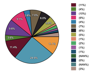 Example income of a practice that is pretty evened out by each payor 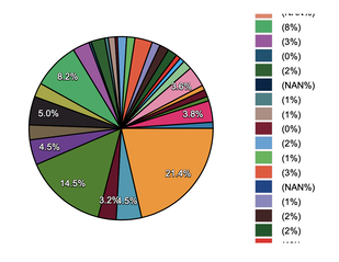 Example of income by locations visited - a flag of going to too many locations in the course of a month Reach out to me to set up any additional reports you would like to see to evaluate your pieces of the pie.
0 Comments
Leave a Reply. |
|
© COPYRIGHT 2021. ALL RIGHTS RESERVED.
Privacy Policy Terms of Service |
|
|

|

|